

Best Multiple Colors Hot Stamping Foil Manufacturer Reveals Secrets to Stunning Foil Designs
2026-07-29
Ever marveled at how luxury packaging or elegant stationery achieves that mesmerizing shimmer? The secret often lies in hot stamping foil—and not all foils are created equal. GUMPTION has spent years mastering the craft, and today we’re pulling back the curtain on what truly makes a foil design unforgettable. Whether you're chasing holographic rainbows or timeless metallics, the devil is in the details—and we’re about to reveal them all.
What Most Designers Overlook With Multicolor Foil
When working with multicolor foil, the assumption tends to lean toward straightforward metallics—gold, silver, maybe a holographic shift. But what’s often missed is how layering multiple foils over different areas can create texture and depth that a single pass just can’t achieve. It isn’t about dumping every color onto a sheet; it’s about strategic placement where overlaps create accidental gradients or subtle surprises that turn a flat print into something tactile. The joy really comes from letting the foil interact with the paper’s tooth, exposing a rawness that polished single-foil jobs rarely have.
Another blind spot is the registration dance between foil colors. Tiny misalignments aren’t always a flaw—they can be intentional, especially when you lean into that handcrafted or risograph-like aesthetic. Designers too often treat misregistration as a failure rather than a tool. When you let a yellow foil peek out from under a neon pink, or allow a thin black foil line to wander slightly, you introduce an unexpected warmth that digital perfection can’t replicate. It’s these quiet accidents that give a piece personality, and that’s exactly what’s missing when every element is locked down too tightly.
The Truth About Color Harmony in Foil Stamping
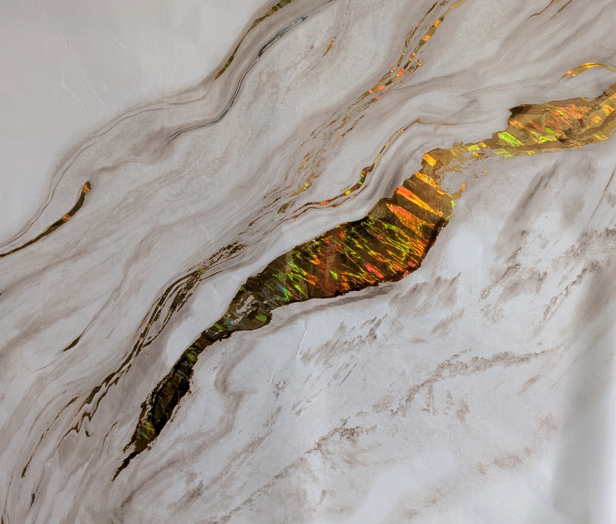
Many designers treat foil stamping like paint, assuming any color combination will work. The reality is that metallic foils have a reflective, almost light-emitting quality that shifts depending on the viewing angle. A foil that looks perfectly matched to a pastel background under studio lights can become jarringly bright under daylight, or vanish into the substrate when seen from a slight angle. Understanding this dynamic is the first step toward genuine harmony—it’s about embracing the foil’s inherent luminance rather than fighting it.
The most successful palettes often draw from nature or fine art, where metallics have been used for centuries alongside matte pigments. A warm gold foil doesn’t just pair well with cream and ochre; it actually amplifies their earthy warmth, creating a layered, tactile richness that flat color alone can’t achieve. Similarly, a cool silver or holographic foil can bring an unexpected edge to a monochromatic cool-gray layout, adding depth without stealing the spotlight. The trick is to let the foil act as a finishing note—a deliberate accent that either harmonizes by analogy or contrasts with purpose.
Beware of the ”more is better” trap. When multiple foils are involved, each additional metallic competes for attention, and the eye can’t settle. A single, well-chosen foil on a carefully selected stock often communicates far more than a rainbow of shiny surfaces. Consider the texture of the paper, the weight of the typography, and the mood of the design before deciding on a foil color. Sometimes the most harmonious result comes from using the foil sparingly—a sliver of copper on a deep indigo card can feel more luxurious than a fully covered surface, precisely because it lets the material speak alongside the metal.
Simple Tricks for Adding Dimension to Flat Surfaces
One of the easiest ways to breathe life into a flat design is by playing with shadows and highlights. A subtle drop shadow can trick the eye into perceiving depth, while a soft inner glow makes an object feel slightly raised. The trick is to keep these effects understated—harsh, unrealistic shadows break the illusion. Pay attention to light direction and consistency; all shadows in your composition should fall as if from the same light source. Even a semi-transparent linear gradient can mimic the way light hits a curved surface, giving buttons or cards a gentle, pillowed look without needing complex 3D software.
Texture is another underused tool for creating depth. A subtle noise overlay or a faint paper grain can instantly make a digital canvas feel tangible. When you combine this with layering, the effect becomes even stronger—imagine a slightly blurred background element paired with a crisper foreground piece. This mimics how a camera lens focuses, naturally pulling the eye toward the sharper object and suggesting spatial separation. You don’t need heavy filters; just a tiny blur on one layer can shift the entire hierarchy of a design.
Color choices also do a lot of heavy lifting. Cool, muted tones tend to recede, while warm, saturated ones pop forward, so you can arrange elements in pseudo-3D space just by tweaking hues. Overlapping shapes with slightly varied opacities can create an overlay effect that feels organic, like pieces of colored glass stacked together. Try breaking the grid: tilting an element or letting it bleed off the edge adds a sense of dynamic motion, hinting at a world beyond the flat rectangle of the screen.
Why Your Metallic Finishes Feel Flat—And How to Fix It
Metallic finishes can sometimes appear lifeless because they rely heavily on the interplay of light and surface. If your lighting setup is too uniform or indirect, the metallic surface loses the contrast and specular highlights that give it depth. The fix often starts with positioning a key light to create a deliberate hotspot, then using reflectors or fill lights to control the falloff. This sculpts the surface, revealing its texture and reflective quality.
Another common issue is the material itself—either the base coat wasn’t smooth enough, or the metallic flakes within the paint are too sparse or inconsistently oriented. To correct this, surface preparation becomes critical: sanding to a flawless base and applying a properly mixed metallic coat in thin, even layers. Allowing each layer to set slightly before the next helps the flakes align in a way that catches light more dynamically, avoiding that flat, muddy look.
Finally, don’t overlook the environment. A metallic object reflects its surroundings, so busy or drab backgrounds can kill the effect. Placing the object against a clean, contrasting backdrop—or using a dark, controlled space—lets the metallic finish pop. Even in post-processing, emphasizing clarity and contrast in the reflective areas can bring back the sense of dimension without making the image look overprocessed.
Mixing Foil Types Without Overcomplicating the Process
Blending different foil finishes doesn’t have to feel like a balancing act. The key is to let one texture take the lead while the others play a supporting role. For instance, pair a matte foil for subtle backgrounds with a glossy accent on key details. This slight contrast adds depth without demanding extra effort.
Think about how light interacts with each surface. A metallic foil will catch the eye differently than a holographic one, so placing them intentionally avoids visual clutter. You can even layer foils during the same application pass if the adhesive allows, saving time and keeping your workspace streamlined.
When you’re ready to experiment, start with small swatches to see how the foils react to heat and pressure together. Often, the most seamless mixes happen when you treat foil choices like seasoning — just enough to enhance, but not so much that it overwhelms the design.
Real Lessons From a Decade of Experimenting With Color
Early on, I thought mastering color meant memorizing the rules—complementary pairs, triadic harmony, never mixing warm and cool. But after years of trial, I realized those guidelines are just starting points. The real shift happened when I began treating color as a language of mood, not a formula. One project taught me that a palette everyone called ‘ugly’ could evoke exactly the right sense of discomfort for a story about memory loss. The lesson? Trust the emotional pull over textbook perfection.
I spent a whole year painting the same still life over and over, just changing the lighting and palette each time. That repetition drilled in something no workshop could: how color temperature changes the narrative. Cool morning light made the scene feel detached and quiet, while a fiery sunset palette pushed it toward nostalgia. Those experiments rewired my brain to see color as invisible storytelling. Now, I start every piece by asking what the scene should feel like, not how it should look.
The best insight came from a total failure—a series I abandoned because the colors fell flat. Eventually, I noticed the problem wasn’t the hues themselves, but the lack of friction. A perfectly cohesive palette can lull the eye to boredom. Since then, I deliberately insert a tiny clash, a note of dissonance, to wake up the viewer. It’s like adding an unexpected ingredient to a familiar recipe. That quiet tension makes the harmony earned, and a decade later, I still rely on that one messy lesson.
FAQ
Look for foil that offers consistent color laydown, heat resistance, and compatibility with your substrate. The best foils have a thin, even coating and release cleanly at a range of temperatures, which prevents cracking or incomplete transfer.
Work with high-quality dies and maintain precise pressure and heat settings. Use a foil that has a fine particle structure and a wide release window—this allows for greater detail without bridging or filling in fine lines.
Top manufacturers use advanced pigment dispersion and layering techniques to build color depth. They also control metallization and coating thickness precisely, ensuring bright, glare-free finishes that resist oxidation and fading.
It usually comes down to poor heat stability or a hard resin layer that doesn't cure properly. Quality foils incorporate flexible, UV-resistant binders and metallic pigments that maintain luster even under wear and environmental exposure.
Make sure your substrate is clean and static-free. Pre-test foil and machine settings; the best manufacturers provide detailed temperature and dwell time recommendations for each foil type to minimize trial and error.
Yes, but you need foil with high elongation and conformability. Look for products specifically designed for deep embossing or rough stock—they have a softer release coating that adapts to the surface contours without cracking.
Request batch-to-batch color consistency data and accelerated aging test results. Reliable suppliers often provide samples and application guidelines, and they can advise on the right foil for your specific press and job requirements.
Advanced holographic and color-shifting foils are becoming more accessible. Manufacturers are also developing foil with embedded micro-textures and matte-gloss combinations, allowing designers to create optical illusions and tactile patterns that stand out.
Conclusion
Many designers miss subtle yet critical aspects of multicolor foil—how light plays across different hues, and how the base material can dramatically shift a shade, often ruining an otherwise careful composition. The secret to color harmony isn't just matching swatches; it's understanding that metallic reflections alter perceived tones, so what looks balanced on screen may clash under real lighting. Bringing flat artwork to life often takes little more than strategic layering or a whisper of debossing beneath the foil, which creates depth without extra clutter. These simple dimensional tricks make the ordinary feel tactile and luxurious, yet they're frequently overlooked in the rush to finalize artwork.
Flat metallic finishes usually stem from ignoring reflectivity angles and surface prep. A minor tweak in stamping pressure or temperature can transform a dull patch into a mirror-like gleam, but it requires testing on the actual stock. Mixing foil types—holographic, matte, glossy—sounds risky, but it's really about balance and sequence; for example, pairing holographic with matte gold only works if you control the sequence and temperature ramp. After a decade of trial and error, the biggest lesson is that standout designs come from pushing materials past their comfort zone, testing unconventional combinations, and respecting each foil's unique behavior. That hands-on experimentation breeds the kind of eye-catching results no preset formula can deliver.
Contact Us
Contact Person: Hsien
Email: [email protected]
Tel/WhatsApp: +86 57387072688
Website: https://www.gsfilm.cn